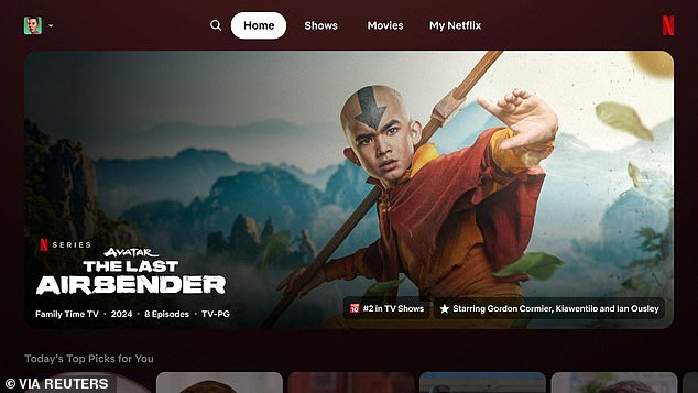
Netflix on Thursday began rolling out the first major overhaul of its TV app in a decade.
The world’s largest streaming service is testing changes designed to help viewers decide more quickly what they want to watch on TV.
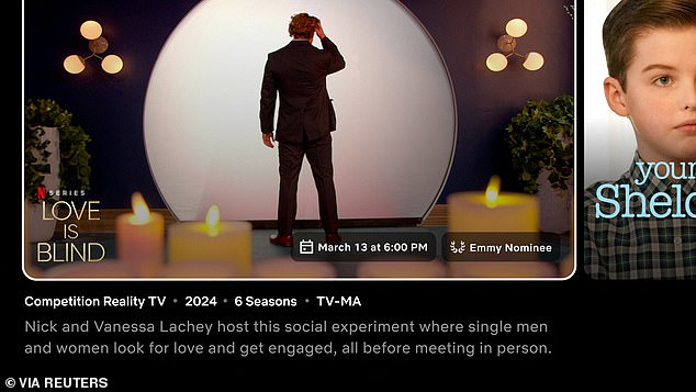
Instead of static tiles, the new look shows boxes that expand to show a preview and more information as soon as the remote selects them.
At the moment in the TV application – found on Apple TV, Roku devices and smart TVs – the trailer and cast details and a synopsis appear at the top of the screen.
Overall, it’s simpler: customers get all the key information in one place. It seems a little less busy and more mobile-like.
The design of the new Netflix app home page is shown. Narrow down the previously available options in the left side menu.

There is now a MyNetflix tab at the top, which was first implemented in the mobile app. Provides quick access to titles you recently viewed or saved.
The changes come after company research showed that users were performing what Netflix executive Pat Flemming called “eye gymnastics” when trying to find a title to watch.
Viewers’ eyes ranged from “the name of the row to today’s top picks, the box art, the video and the synopsis,” Flemming, senior director of member products, told Reuters in an interview.
“We really wanted to make it simpler, more intuitive and easier to navigate.”
The video streaming pioneer wants to increase the time viewers spend in the app to help retain customers and attract subscribers to its new lower-cost ad-supported plans.
Revisions to the home page included expanding title cards, reorganizing information, and highlighting easy-to-read facts, such as a show or movie that “spent 8 weeks in the top 10.”
A subset of Netflix’s nearly 270 million users worldwide will watch the new format starting Thursday. They have been selected at random.
The company will take feedback and possibly make changes before revealing it more widely.
Netflix has been emphasizing engagement time as a key metric, telling investors it is the “best indicator of customer satisfaction.”
The company will stop regularly reporting subscriber numbers next year to shift focus from Wall Street.

Trailers will appear in an enlarged tile, meaning viewers don’t need to look up at the top of the screen. This borrows a feature from Hulu.
Among other changes to the TV app, the menu button has been moved from the left to the top of the screen.
A new ‘My Netflix’ tab has been added, with shows or movies that a user has started watching, or saved to watch later.
Netflix will continue to offer personalized suggestions to each user. It will not make any changes to its recommendation algorithm as part of the redesign, Flemming said.


