<!–
<!–
<!– <!–
<!–
<!–
<!–
An interior design expert has revealed how to make your home look more expensive in minutes – and all you have to do is make one simple change.
Tayler Lowden, from Ohio, regularly shares tips on how to upgrade your home on a budget.
And in her latest video, she said the simple act of moving your sofa away from the wall lifts the living space and gives it a more ‘luxurious’ feel.
“If the back of their couch touches the wall, then they’re not rich,” she said. ‘Rich people just have their sofas out there.’
To prove her point, Tayler demonstrated the move in a video and immediately transformed her living room.
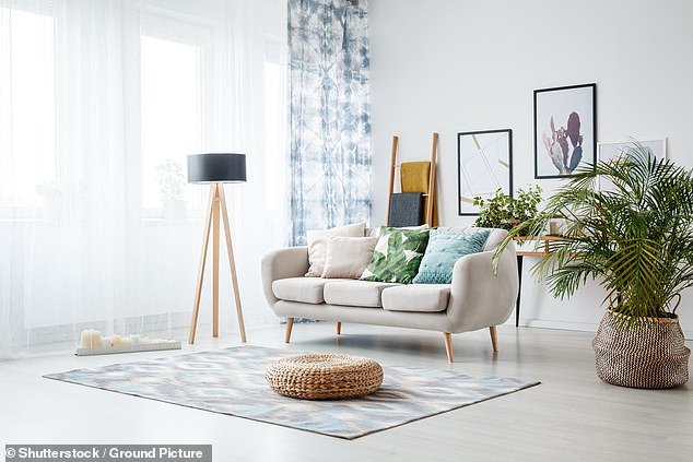
Tayler Lowden said the back of your couch shouldn’t touch a wall
Most professionals say that embracing ‘floating furniture’ is the best long-term solution for your home’s aesthetics.
To do this, simply start decorating in the middle of the room and then place your furniture out so that nothing is pushed up against a wall.
Contrary to popular belief, floating furniture makes the room feel and look bigger because you create a more intimate seating arrangement while freeing up wall space.
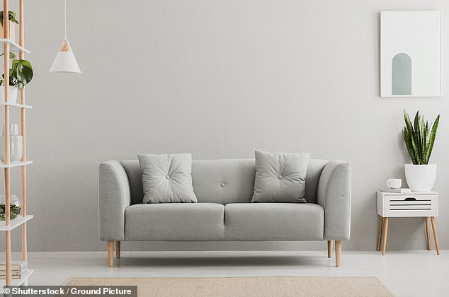

Contrary to popular belief, floating furniture makes the room feel and look bigger because you create a more intimate seating arrangement while freeing up wall space
Another mistake most people make is having the wrong size artwork for their walls – which instantly makes the home look cheaper.
Julie Sousa has spent years working in the interior design and content creation industry and often shares advice online on how to spruce up a property.
She recommended using a simple calculation to measure the ideal frame size – and thousands admit it has ‘saved’ their living rooms.
Multiply the length of the wall by 0.60 to get the minimum length needed, then multiply the length of the wall by 0.75 to get your maximum length. Both numbers will serve as a range for the appropriate length for your artwork. Repeat these steps for the width,” she said.


Julie Sousa has spent years working in the interior design and content creation industry and often shares advice online on how to spruce up a property
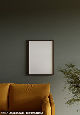

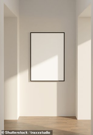

The expert recently shared that having the wrong size artwork for walls instantly makes the room look cheaper
The interior designer showed an example of a wall in her home where she replaced a small piece of art with a larger one and immediately made it look more striking.
The rule also helps when artwork or a photo frame is too big for walls and catches attention from the rest of the room.
Ms. Sousa offered some more advice for different scenarios.
‘In a narrow hallway I would suggest using mirrors – unless there is an entry point where your body faces the art directly, then art is a good option. And yes, the same dimensions would apply,’ she advised.
The expert also revealed that if you have a piece of furniture – such as a console table – against the wall, it is important to measure only the empty space and not the entire wall.
“If you have a piece of furniture against the wall, only the wall space above the piece of furniture will be calculated. Maybe choose the smaller dimension, closer to 0.60, to leave enough negative space around the edges,” she added.
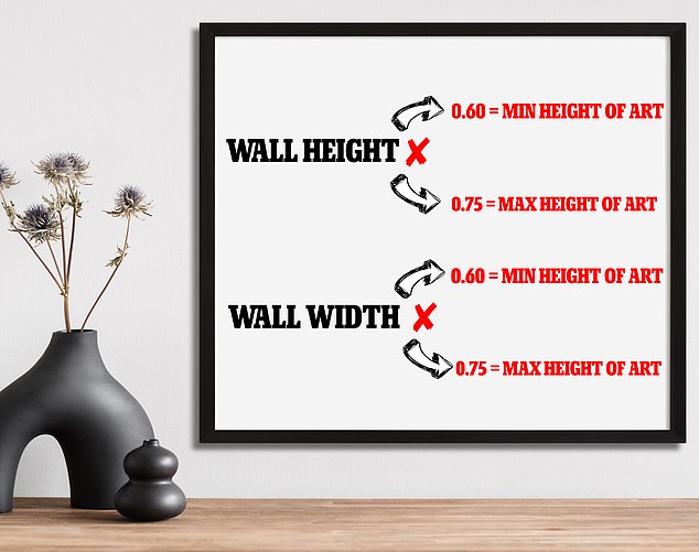

Use this simple calculation to find the ideal area for a piece of art in your home
Hundreds were in awe of her simple tip.
‘I must say that is an absolutely phenomenal tip!’ said one.
“Now it actually looks expensive,” added another.
‘Perfect scale for the artwork! Looks so much better!’ said a third.

