Staging a property is the most important part of selling multi-million dollar homes.
When a completely empty property hits the market, potential buyers walk into every room and everyone feels the same way. They don’t know how to use that space.
But when it is organized, renovated and furnished, they know how to use the different living spaces and can imagine themselves there. It makes that dream they have come true.
I’m Liv Conlon. I run the multi-award winning ThePropertyStagers, featuring 400 properties a year across the UK.
Earlier this year, the owners of a newly built five-bedroom detached property in St Neots, Cambridgeshire, hired my team and I to prepare the empty property for sale.
The 1.5-acre home features a grand hallway with a stunning central staircase, five private bathrooms, its own lake, and stunning views. We focused on seven key aspects to convert the spacious, completely empty property, called Wintringham Lodge, into a desirable family home.
But you can use these tips and tricks to give your own home a luxurious makeover—without complicated renovations or expensive materials.
A room with a ‘wow factor’
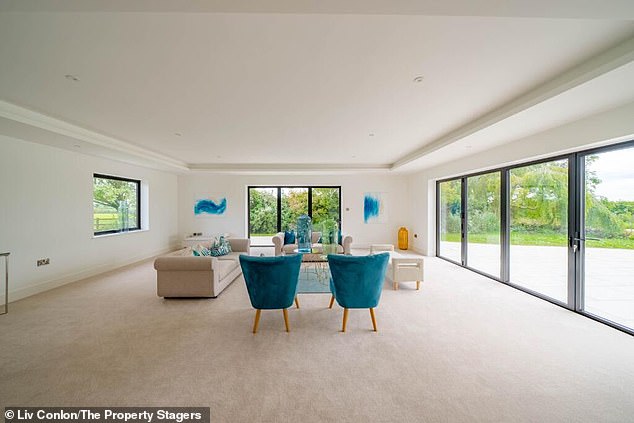
The bold leaf patterns on the cushions perfectly complement the country feel of the property.
We wanted to keep the living room looking modern and sleek, focusing on clean lines, neutral tones, and strategic use of colorful accents.
While we opted for a beige rug and white walls, which created a calm and spacious atmosphere, the teal and turquoise armchairs and artwork provided vibrant pops of color that added depth and interest to the space.
We also added two light-colored sofas, two chairs, and a chaise lounge to emphasize where the connecting spots would be and demonstrate seating options.
Finally, the bold leaf patterns on the cushions perfectly complement the country feel of the property, which is surrounded by greenery, trees and wildlife. We wanted to bring the outside in and bring this space to life.
When you are in properties like this, newly built, with white walls, light floors and large spaces, people can feel overwhelmed and not know what to do with them. Then we added that pop of color to create that warm, fuzzy feeling.
I love making over-the-top, large-scale accessories that add that touch of glamour.
A vibrant family room
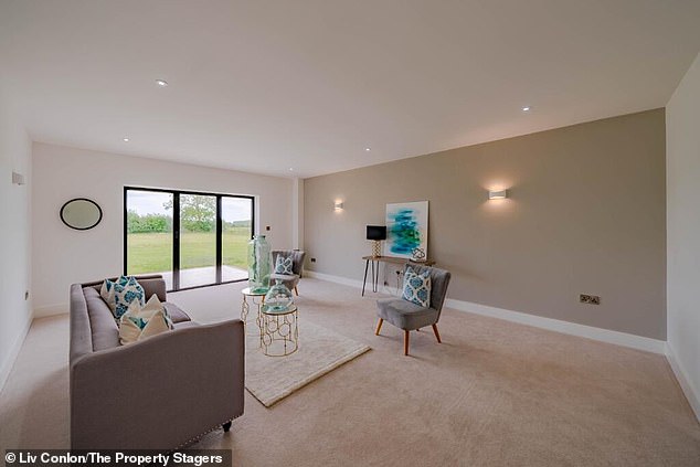
The family room was designed to be relaxing and serene, yet functional.
The house has a second living room, which could be used as a TV room or family room. We decided on the latter and set out to design the room to be relaxing and serene, as well as functional at the same time.
We chose a large three-seater sofa in a calming, neutral color like this light gray fabric, and added two modern decorative charis with wooden legs and a patterned cushion.
This adds an element of sophistication and provides additional seating without overcrowding the space. Pops of turquoise and teal on the pillows and decorative elements add a fun and refreshing touch without overwhelming the space.
The American kitchen that sells this house
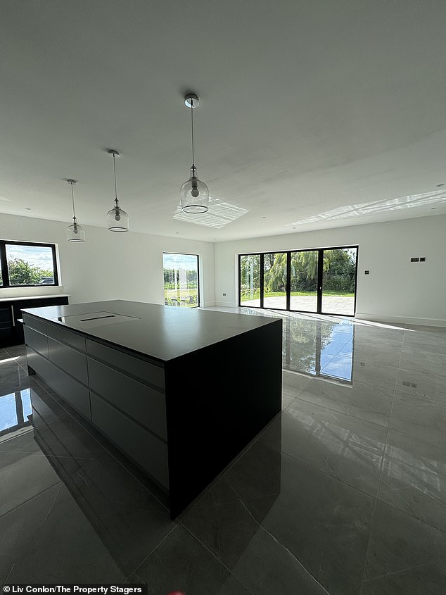
A view of the open plan kitchen before The Property Stagers transformed it
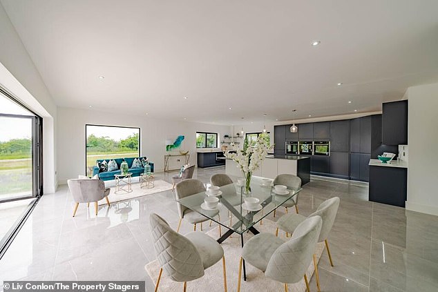
The use of sleek matte cabinets and shelves instantly negated the cold laboratory feel of the room prior to staging.
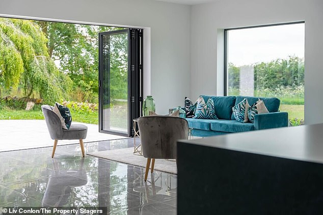
A bright sofa can warm up the space.
The kitchen was reinvented as a luxurious, modern and sophisticated space that combines contemporary design with functionality.
We decided on sleek matte gray cabinets and shelves that instantly negated the cold lab vibe. We added a fun teal velvet sofa to warm up the space while continuing the theme with patterned throw pillows in different shades of blue and teal for texture.
Two gold-framed coffee tables with glass tops complement the sofa and add a touch of luxury, while the tables’ metallic finish echoes other accents in the room. The dining room is expressly prepared for six people and functions as a perfect conversation area. The key to organizing a kitchen is to add large, bold items, but without overdoing the countertops.
When we sell a property, we don’t put the kettle, toaster or microwave on the worktop, but rather give it an elegant and classic style.
Fix the home office
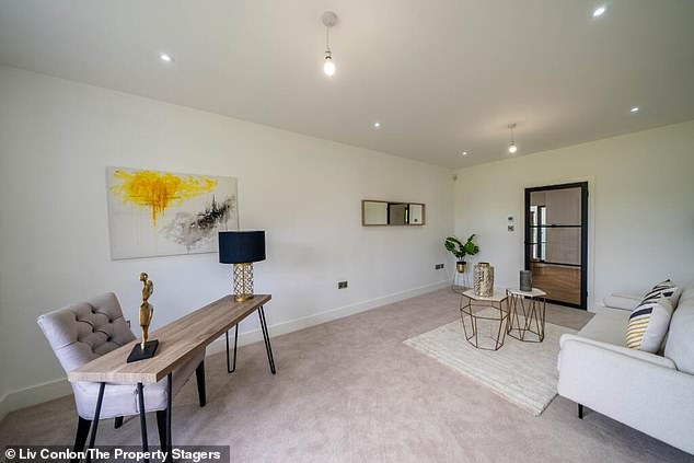
The office features a contemporary wooden desk with a natural finish, providing a warm contrast to the lighter tones in the room.
The final reception room was transformed into a home office as it is now vital to most people’s living spaces.
The space exhibits a clean and modern aesthetic with a minimalist design. The room integrates functionality with style, focusing on a bright and open atmosphere conducive to productivity.
The office features a contemporary wooden desk with a natural finish, which provides a warm contrast to the lighter tones in the room. The desk is spacious, offers ample space for work materials and equipment, and includes a comfortable upholstered chair.
We’ve also doubled it down by placing a sofa and coffee table here to demonstrate a relaxed work environment.
Finally, we opted for a slightly different color scheme and incorporated pops of yellow and black to differentiate the vibe between living and working at home.
Transforming the master bedroom
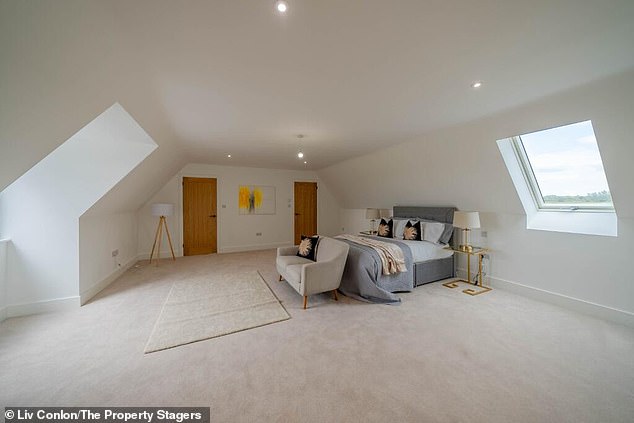
The art of staging is showing someone how to use a space, but without overfurnishing it.
The key to creating a master bedroom that really appeals to potential buyers is to design it to look luxurious and inviting, so they want to see themselves living in that space.
To do this, we decided on a minimalist and modern design, placing emphasis on space, light and comfort.
The room is dominated by a neutral color palette, with light cream carpets and white walls, creating a serene and relaxing atmosphere. I added a modern bed with a tall, upholstered light gray headboard for sophistication and comfort.
It is carefully made with crisp white sheets and darker gray throws and throws for a cozy feel. There are also two elegant metal nightstands flanking the bed. Its mirrored surfaces and minimalist design add a touch of elegance and modernity.
While more furniture could be added to this huge space, the art of staging is showing someone how to use a space, but without overfurnishing it.
You are showing an example of the lifestyle they would have if they lived here.
Minimalism sells for bathrooms.
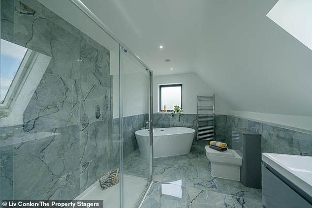
Keeping things to a minimum is crucial when designing a bathroom.
The master bathroom in this property features an incredible bathtub and large walk-in shower, but the key to organizing a bathroom is to use minimal elements to add style to the space.
We added some towels to warm it up, but since these bathrooms are beautiful, we don’t want to over style it.
Extra bedrooms with your own style
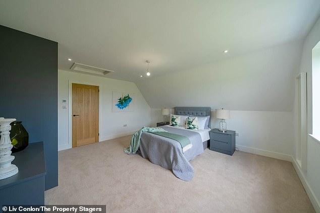
Liv’s top tip for designing multiple rooms in the same property is to have a cohesive theme that manifests itself in slightly different, but harmonious ways.
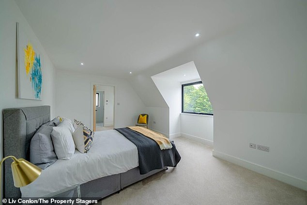
The “yellow bedroom” has a fruity vibe with original artwork and a matching bedspread.
In the second master bedroom, we focused on symmetry. The bed was deliberately placed in the center of the space with two matching nightstands and lamps.
There is an area set up for a dressing table, from where dorm residents can enjoy the view of the idyllic plot.
We went for a warm purple tone in this room with greens and blues to create that luxurious feel in addition to the velvet button ottoman at the end of the bed.
The third and fourth bedrooms are mirrors of each other, so it was a priority for the staging team to demonstrate symmetry but also differentiate them.
They have the same space, closets and bathrooms but the staging options are different.
One is a “green bedroom” with palm tree prints and a nature theme, while the “yellow bedroom” has a fruity vibe with original artwork and a matching bedspread.
My top tip for designing multiple rooms in the same property is to have a cohesive theme that manifests itself in slightly different, but harmonious, ways.


