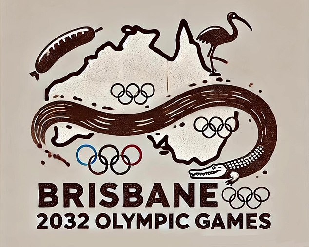
- Unofficial logo for Brisbane Olympics released
- Fans believe the logo is real and criticize the design
- The logo features an ibis and a sausage.
The Brisbane 2032 Olympics have come under fire from Australians who have shared an unofficial logo on social media featuring some very questionable Queensland icons.
Brisbane will host the premier international sporting event in eight years’ time and designers have been hard at work creating iconic emblems for the Games.
However, an unofficial logo recently caused a stir on the Internet and many Australians believed it was real.
The logo features a map of Australia and includes an image of an ibis, a sausage and a crocodile seemingly representing the Brisbane River.
Fans online criticized the design and one TikTok user’s reaction went viral.
“If you thought the Paris Olympics were a failure, check out the Brisbane logo they just announced for the 2032 Olympics,” content creator Sebbylaz told his 4.4 million followers.
‘My God! Have you ever seen anything more Australian?’
“The fact that we are fully claiming our brown and dirty river is crazy. The athletes were afraid to swim in the Siene River… girls, you’re in for a treat.
An unofficial logo (pictured) for the Brisbane Games was criticised by Australians

Brisbane is currently preparing for the 2032 Olympic Games
‘They were afraid of catching a little areola disease in the Siene, you’re not going to have time to catch anything because a bull shark is going to kill you first.
‘This will be the first Olympics where we actually win, because everyone will be too terrified to come to Australia and compete.
“The fact that they have a Bunning’s snag and a bin chicken (Ibis) is really iconic. I respect that. The only thing missing from this is the C word – I’m surprised it’s not in the middle.”
The viral video sparked over a thousand responses, with many people also being amazed by the design.
“It’s a lot to process,” one fan responded.
“Did Raygun design this?” another joked.
“Surviving in Australia should be an Olympic game in itself,” said a third.
Others approved of the concept, saying it was suitable for the nation.
“The inclusion of chicken in the container is a success!” said one user.
“I honestly love this logo for Australia,” commented another.
“I think it’s cute, it’s nostalgic, it’s vintage, it’s demure,” posted a third.


